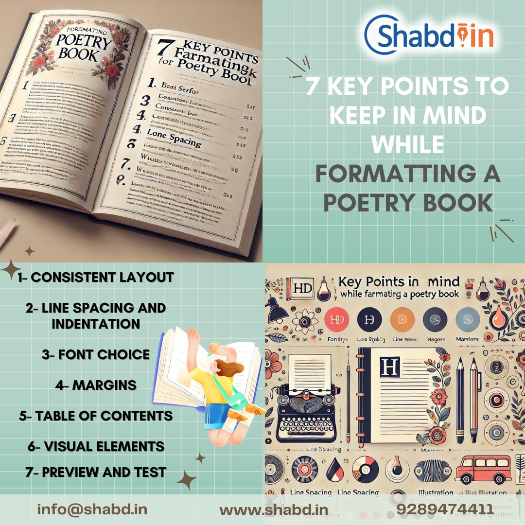
Here’s a breakdown of each key point to keep in mind when formatting a poetry book:
1- Consistent Layout
Maintaining a uniform structure across all pages is essential for a professional look. Keep header, footer, and page number placements consistent, and ensure each poem title is formatted uniformly. A consistent layout not only makes the book aesthetically pleasing but also enhances readability.
2- Line Spacing and Indentation
Poetry often relies on specific line spacing and indentation to convey rhythm and emphasis. Standardize your line spacing throughout the book, usually between 1.15 and 1.5, depending on your style. Indentations or hanging indents can be used for stanza breaks or special formatting effects, but keep these choices uniform to create a cohesive flow.
3- Font Choice
Choose a font that is easy to read yet complements the tone of your poetry. Serif fonts, like Times New Roman or Garamond, are traditional and provide a classic feel, while sans-serif fonts, like Helvetica or Arial, can give a modern look. Avoid elaborate or hard-to-read fonts, as clarity is crucial for the reader’s experience.
4- Margins
Generous margins provide whitespace around the text, giving each poem room to breathe on the page. Aim for wider margins (around 1 inch or more) to prevent crowding, especially on the binding edge, and to improve readability. This also leaves space for any visual elements or annotations you may want to add.
5- Table of Contents
A Table of Contents is essential for ease of navigation, especially in longer collections. List each poem by title, and include page numbers to guide readers. A clear, well-organized table of contents enhances the book’s usability and allows readers to revisit favorite poems easily.
6- Visual Elements
Integrate visual elements, like illustrations, photographs, or decorative flourishes, thoughtfully. Make sure these images or designs complement rather than overpower the text, as the poetry should remain the focal point. Consider the placement and alignment of visual elements to maintain harmony with the text layout.
7- Preview and Test
Before finalizing, thoroughly review the book in multiple formats—print, PDF, and ebook—to ensure the design holds up in each. Testing across different formats can reveal formatting issues that aren’t immediately obvious and ensures a quality reader experience regardless of medium.

