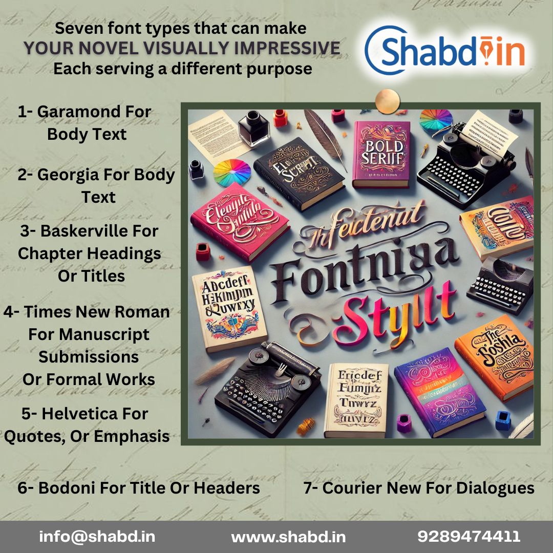
Here’s an overview of the seven font types and how they can enhance your novel’s presentation:
1. Garamond – For Body Text
- Why: A timeless classic, Garamond is elegant and easy to read. Its refined appearance is excellent for long stretches of text, offering a pleasant reading experience.
- Usage: Best for printed novels and ebooks with a traditional vibe.
2. Georgia – For Body Text
- Why: Georgia combines readability with a slightly modern touch. Designed for screen use, it works well in digital formats.
- Usage: Ideal for ebooks and online publications.
3. Baskerville – For Chapter Headings or Titles
- Why: Baskerville exudes sophistication and authority, making it perfect for emphasizing section breaks or important titles.
- Usage: Chapter headings, subheadings, and standout quotes.
4. Times New Roman – For Manuscript Submissions or Formal Works
- Why: As a standard in the publishing industry, Times New Roman ensures a professional look and feel.
- Usage: Manuscript submissions to agents or publishers.
5. Helvetica – For Quotes or Emphasis
- Why: Clean, modern, and versatile, Helvetica draws attention without being distracting.
- Usage: Highlighted quotes, special text, or stylistic emphasis in design-focused books.
6. Bodoni – For Titles or Headers
- Why: Bodoni’s dramatic contrast and stylish curves make it an eye-catching choice for titles and headers.
- Usage: Book covers, title pages, or chapter headers in high-design genres.
7. Courier New – For Dialogues Description
- Why: Courier New mimics the typewriter’s nostalgic charm, making it excellent for screenplay-style dialogue or specific thematic purposes.
- Usage: In-text letters, notes, or a character’s inner monologue.
Each font offers a distinct feel and functionality. Mixing and matching these fonts thoughtfully can make your novel not just a story but a visual delight! Would you like help designing a font-based mockup?

